
 【獎項 Prizes】優選 Distinction
【國家或地區 Country / Region】 台灣 Taiwan
【設計團隊 Group / 設計師 Designer】 中原大學商業設計學系 CYCD 第35屆畢製展場組
【作品介紹 Description】
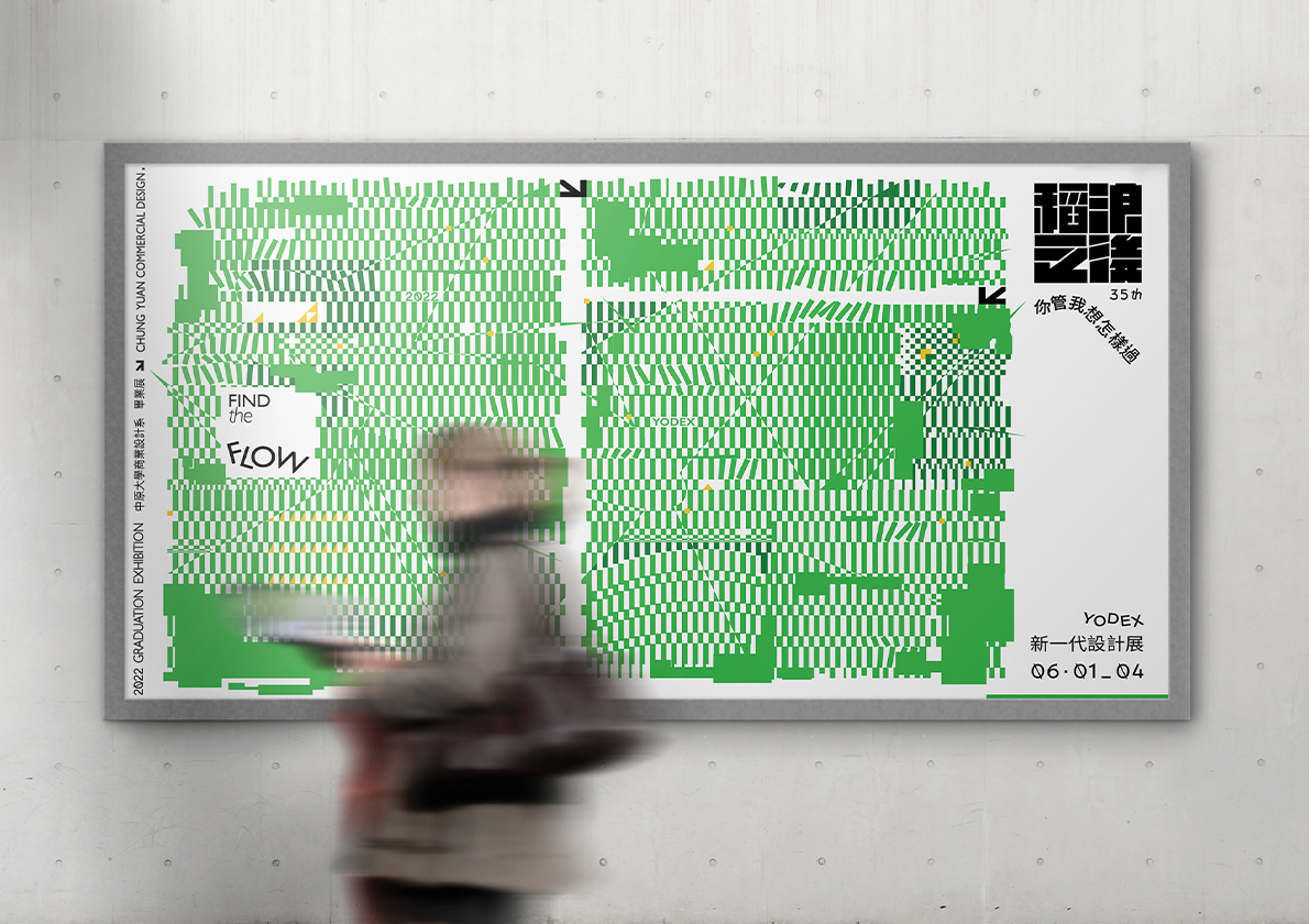
本屆視覺以自由和開拓作為主軸,並以稻田比喻這四年的收獲、成果。在收割稻田時所產生的稻浪,將會隨著各自的選擇開拓出不同的方向,在稻浪之後劃出無限的可能。稻浪之後我們會在哪裏?我們希望稻浪之後是自由的、充滿可能性的。
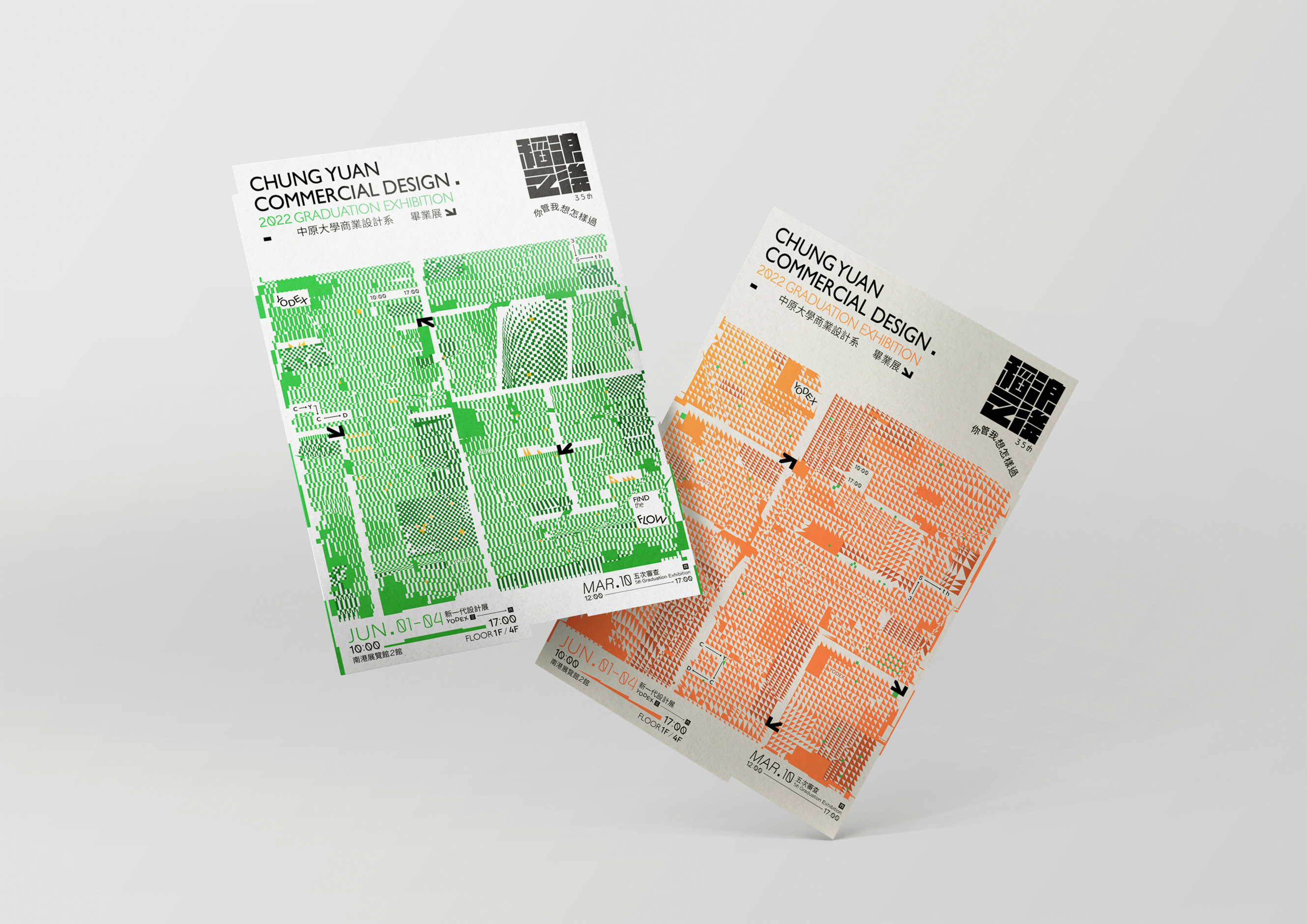
在視覺上為了呈現稻田的氛圍,顏色選用了豐收的綠色和成熟的橘色作為兩款視覺的延伸。並透過簡單的幾何與畫面的切割模擬稻浪的活動及軌跡,開拓的道路則形成稻與浪二字的負空間。
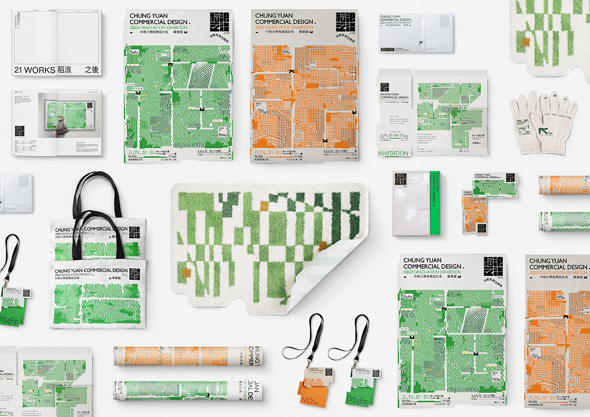
除了海報以外,我們以種稻從青澀到成熟的四個階段,來相繼對應在周邊上,首先,象徵育苗的「手套」,是起步的開端;繁盛的「地毯」,則是成長的證明;象徵收成的「編織袋」,是讓我們盛著各自的所學所得;最終篩選出最精煉的成果,彙集成我們的「畢刊」。而這樣的設定讓整體的設計物更有深度,也更對應到我們的主題。
The vision of this year takes freedom and pioneering as the concept, and uses rice waves as metaphors for the harvest of these four years. The rice waves generated during the harvesting of the rice field will open in different directions according to various choices. Where will we be after the rice waves? We hope that behind the rice waves are freedom and possibility.
In order to present the atmosphere of the rice paddies, the colors have chosen harvest green and ripe orange as extensions of the two visuals. At the same time, through the simple geometry and picture cutting, the activity of rice waves is simulated, and the pioneering road forms a negative space of the word "rice" and "waves".
Except for the poster, we use the four steps of rice planting from green to mature, which correspond to the merchandise successively. First of all, the "gloves", which symbolize seedlings, are the beginning of the start; the flourishing "carpet" is a proof of growth; the woven bag, which means the harvest; the most refined results are selected and collected into our "publication".


